
What Makes a Visual Identity Feel Premium?
- Mariane Paulino
- Mar 5
- 1 min read

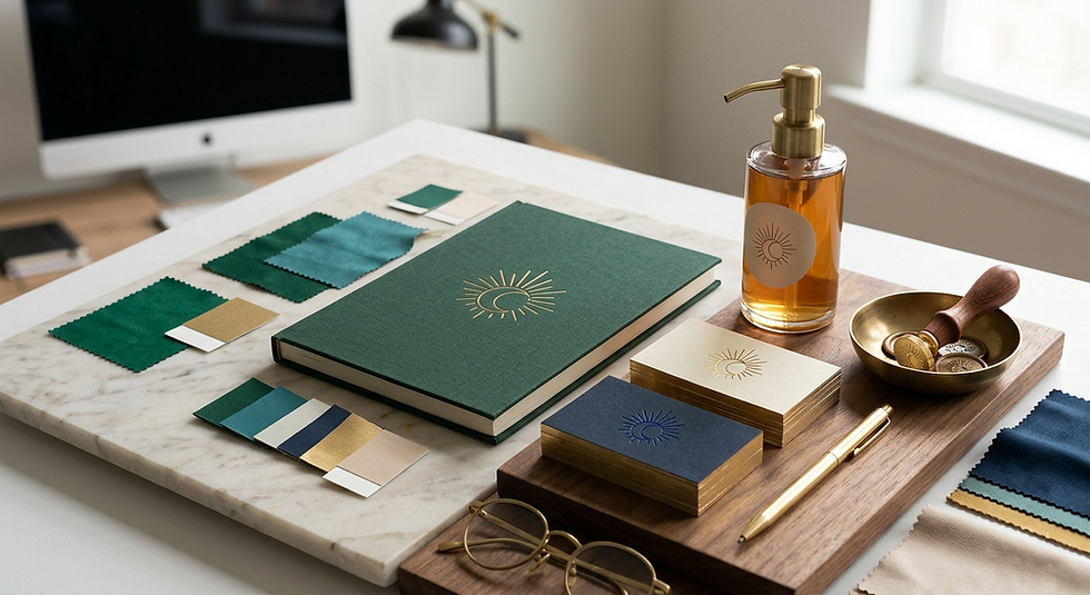
When I think about identities that feel premium, they usually share the same foundations.
Strong typographic systems instead of decorative fonts.
Controlled spacing that gives everything room to breathe.
Consistency that removes doubt from every touchpoint.
Color used with intention, not intensity.
There is also something subtle about hierarchy.
Premium design does not try to make everything important at the same time. It guides the eye quietly, without forcing attention.
Nothing competes.
Everything has a reason to exist.
The silence between elements is part of the design.
The more confident a system feels, the less it needs to prove its value through noise.
Mariane


Comments